Friday, 29 February 2008

Shrink PDFs with ColorSync Utility


Launch ColorSync Utility from your OSX Utilities folder. At the top, hit Filters ... and Reduce File Size ... and then View file with filter and go and look for your pdf file. Mine was 772k file for a small 45mm sticker art!

You can also click Duplicate and work on a copy.

Click the Details button and then ... Images and scale away. 50% got my pdf down to 444k. Yeah, yeah, I know it can be done in Acrobat or whatever and what with broadband and huge drives it is a bit of a pointless exercise but it is amazing what is tucked away in OSX.

Monday, 25 February 2008

Dots brush in Illustrator


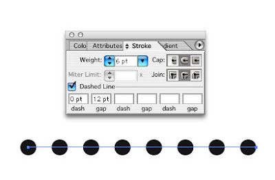
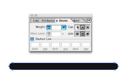
The usual way to create a dotted line in Illustrator is to use the dashed line dialog in the Stroke panel. But just say that dotted rule had Outline Stroke applied to it. Yikes! Dots no more, just a single oval thing now appears. Expand apprearance does something similar, turns the dots into one long rectangle.

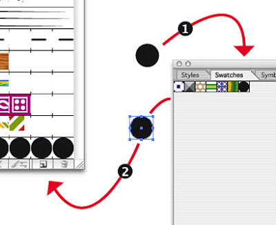
Here's a much more flexible approach to applying dots to rules, ovals and boxes. First create a simple dot shape. Now drag that dot into the Swatches panel, then drag the now swatch of the dot onto the desktop and then onto the New Brush icon on the Brushes panel and hit New Pattern Brush.

In the Pattern Brush Options set it up like so. You want to fill up those five boxes at the top by clicking on one and then clicking New Pattern Swatch. Set the Colorization to Hue Shift, so you can change the colour of your dots later by simply changing the stroke colour. Set the Size as below to begin with but altering them you can change the spacing between your dots later. Also altering the stroke size will increase the size of the dots.

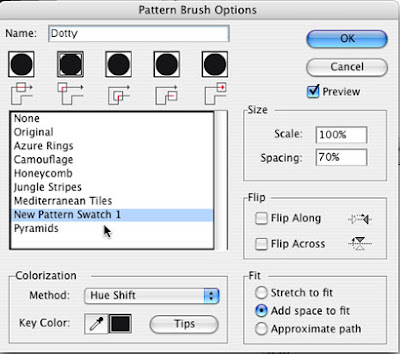
Finally click Add space to fit will automatically adjust the dots applied to ovals, circles and boxes. Make a file with this brush, call it dots or whatever and dump the file into your Illustrator - Presets - Brushes folder, and when you restart Illustrator it will be available in your Window - Brush Libraries pull down dialog.

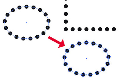
Now when you go Expand Appearance, the dots remain dots.

Monday, 18 February 2008

Barbed wire Illustrator brush


Keep it simple. A fairly realistic metallic feel can be created with three colours. The twisted wire I created using the Zig zag filter on a horizontal stroke, and then Reflected a copy. Ta-dah! Twisted wire.

Anticipate how the ends of your short section of wire will look once it starts repeating.

Once you are happy with your art, drag it onto the New Brush icon on the Brushes panel and hit radio button New Pattern Brush. Use the Hue Shift Colorization Method and then you can easily change the overall colour of the brush by changing the stroke colour of the path that you have attached the barbed wire brush to.

Saturday, 8 December 2007

Opacity masks in Illustrator


This is a fairly complex illustration that I've been working on in Adobe Illustrator, describing the techniques of catheter insertion. The area of interest is the upper chest and neck.


I needed a way of soft masking the other areas in a controlled way. I have an opaque skin shape that would otherwise cover the underlying anatomy. To that skin shape I have attached an opacity mask. So I have a body skin shape and then I drew a box covering it, then I applied a black and white linear gradient to that box.


Next I selected both box and the skin shape, and from the side tab of the Transparency panel, selected Make Opacity Mask. Now in the Transparency panel you should see the shape and it's mask. Highlight the mask part and get up the Gradient panel. Now fine-tune the gradient to control mask the areas of your art.

But there is more than this to Opacity Masks in Illustrator. The mask I created for this illustration is just a linear gradient. It is possible to create a custom black and white raster image in Photoshop, save that as a tiff, and then place that in Illustrator above the illustration, select both and make an Opacity Mask. Or use a texture or a photo.

Monday, 5 November 2007

Repeat Transform Fractals


Create a Photoshop document, at whatever approx size you want your fractal to be. Add a layer above the background layer. Create a shape possibly with the Custom shape tool, change that vector shape into a raster shape and use a layer style to style like a gel. Create a layer under that and then flatten those two layers so they float above the background layer and gets rid of the layer style info. Multiple layers with styles will slow things down,

Next, use the Free transform tool, or Apple+T or Ctrl+T(pc) to enlarge or reduce the graphic, rotate it a bit and move it slightly away from it's original position. In the top blue image I first reduced the original graphic and in this rainbow image I enlarged it.

Great! Nothing special yet. Now use the keystroke Apple+option+shift+T or Ctrl+alt+shift+T(pc) ... and the graphic now duplicates itself onto a new layer but slightly transformed. Keep on repeating the keystroke and the pattern will build up. Flatten that group, flip it horizontally and you can see the potential for fractal-like patterns.

Friday, 2 November 2007

Fun with Gradient Map ...

A typical catalogue or brochure design may have a repeating device for each section, each one a different colour for each section.

One simple and quick way to do this is make a greyscale tiff of the section graphic, open that in Quark and colour each one for every section. But it is a bit crude and the coloured device can look very flat with no depth. A better way is to use Gradient Map in Photoshop. Create a black and white version of the repeat image if it is in colour. There is a number of ways to do this. You could use the Gradient Map with a black white gradient.

Ok you have a black and white image in a Photoshop file that you are happy with. Get into the Gradient Editor through the Gradient tool and set up the various gradients you require for each section. Back to the image file create an adjustment layer using Gradient Map... . Select the colour gradient you want and the image is coloured. Looks ok, but can be better. The Adjustment layer's color mode defaults to normal. Change that to Color. Looks better now. Not flat as before. Create a new Adjustment layer and do the next colour. But then maybe you want it to be flat because there is a heading running over the top of the image.

You can create a similar effect by simply putting a layer of colour over the top of the black and white image and setting the layer mode to color, but using the Gradient Map method it is possible to introduce subtle colour variations in the gradient, say a blue-ish hue in a mostly magenta. Also it is possible do something similar by creating a duo-tone of the image. The advantage with the adjustment layer Gradient Map method, is that it is editable. With a catalogue of say 15 different colour dividers there is always going to be some possible colour revisions.