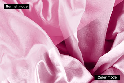
One simple and quick way to do this is make a greyscale tiff of the section graphic, open that in Quark and colour each one for every section. But it is a bit crude and the coloured device can look very flat with no depth. A better way is to use Gradient Map in Photoshop. Create a black and white version of the repeat image if it is in colour. There is a number of ways to do this. You could use the Gradient Map with a black white gradient.
Ok you have a black and white image in a Photoshop file that you are happy with. Get into the Gradient Editor through the Gradient tool and set up the various gradients you require for each section. Back to the image file create an adjustment layer using Gradient Map... . Select the colour gradient you want and the image is coloured. Looks ok, but can be better. The Adjustment layer's color mode defaults to normal. Change that to Color. Looks better now. Not flat as before. Create a new Adjustment layer and do the next colour. But then maybe you want it to be flat because there is a heading running over the top of the image.

You can create a similar effect by simply putting a layer of colour over the top of the black and white image and setting the layer mode to color, but using the Gradient Map method it is possible to introduce subtle colour variations in the gradient, say a blue-ish hue in a mostly magenta. Also it is possible do something similar by creating a duo-tone of the image. The advantage with the adjustment layer Gradient Map method, is that it is editable. With a catalogue of say 15 different colour dividers there is always going to be some possible colour revisions.

No comments:
Post a Comment