Saturday, 8 December 2007
Opacity masks in Illustrator
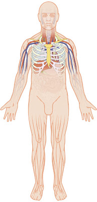
This is a fairly complex illustration that I've been working on in Adobe Illustrator, describing the techniques of catheter insertion. The area of interest is the upper chest and neck.
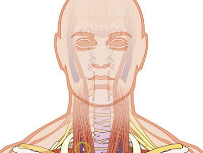
I needed a way of soft masking the other areas in a controlled way. I have an opaque skin shape that would otherwise cover the underlying anatomy. To that skin shape I have attached an opacity mask. So I have a body skin shape and then I drew a box covering it, then I applied a black and white linear gradient to that box.
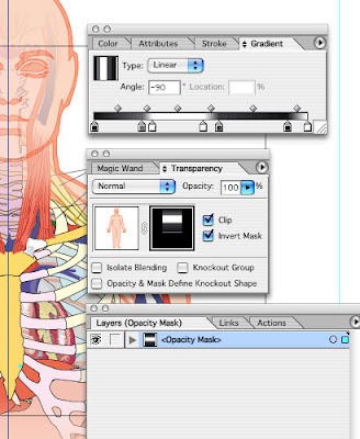
Next I selected both box and the skin shape, and from the side tab of the Transparency panel, selected Make Opacity Mask. Now in the Transparency panel you should see the shape and it's mask. Highlight the mask part and get up the Gradient panel. Now fine-tune the gradient to control mask the areas of your art.
But there is more than this to Opacity Masks in Illustrator. The mask I created for this illustration is just a linear gradient. It is possible to create a custom black and white raster image in Photoshop, save that as a tiff, and then place that in Illustrator above the illustration, select both and make an Opacity Mask. Or use a texture or a photo.
Labels:
Gradient panel,
Illustrator,
Opacity masks,
soft mask
Monday, 5 November 2007
Repeat Transform Fractals
Create a Photoshop document, at whatever approx size you want your fractal to be. Add a layer above the background layer. Create a shape possibly with the Custom shape tool, change that vector shape into a raster shape and use a layer style to style like a gel. Create a layer under that and then flatten those two layers so they float above the background layer and gets rid of the layer style info. Multiple layers with styles will slow things down,
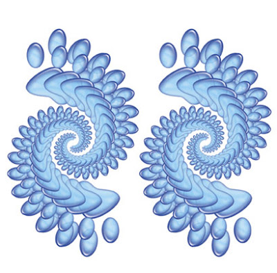
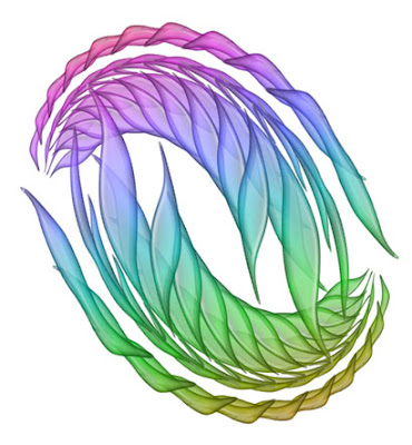
Next, use the Free transform tool, or Apple+T or Ctrl+T(pc) to enlarge or reduce the graphic, rotate it a bit and move it slightly away from it's original position. In the top blue image I first reduced the original graphic and in this rainbow image I enlarged it.
Great! Nothing special yet. Now use the keystroke Apple+option+shift+T or Ctrl+alt+shift+T(pc) ... and the graphic now duplicates itself onto a new layer but slightly transformed. Keep on repeating the keystroke and the pattern will build up. Flatten that group, flip it horizontally and you can see the potential for fractal-like patterns.
Friday, 2 November 2007
Fun with Gradient Map ...
A typical catalogue or brochure design may have a repeating device for each section, each one a different colour for each section.
One simple and quick way to do this is make a greyscale tiff of the section graphic, open that in Quark and colour each one for every section. But it is a bit crude and the coloured device can look very flat with no depth. A better way is to use Gradient Map in Photoshop. Create a black and white version of the repeat image if it is in colour. There is a number of ways to do this. You could use the Gradient Map with a black white gradient.
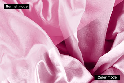
Ok you have a black and white image in a Photoshop file that you are happy with. Get into the Gradient Editor through the Gradient tool and set up the various gradients you require for each section. Back to the image file create an adjustment layer using Gradient Map... . Select the colour gradient you want and the image is coloured. Looks ok, but can be better. The Adjustment layer's color mode defaults to normal. Change that to Color. Looks better now. Not flat as before. Create a new Adjustment layer and do the next colour. But then maybe you want it to be flat because there is a heading running over the top of the image.
You can create a similar effect by simply putting a layer of colour over the top of the black and white image and setting the layer mode to color, but using the Gradient Map method it is possible to introduce subtle colour variations in the gradient, say a blue-ish hue in a mostly magenta. Also it is possible do something similar by creating a duo-tone of the image. The advantage with the adjustment layer Gradient Map method, is that it is editable. With a catalogue of say 15 different colour dividers there is always going to be some possible colour revisions.
Wednesday, 31 October 2007
Corel Painter line and colour
I dug out my copy of Corel Painter for a bit of arty fun. I had taken this photo of some glass paperweights in my recently constructed cheapo light tent.
When I opened the jpeg in Painter, the program threw up an error code. Something it didn't like. Maybe possibly wasn't happy with a sRGB jpeg as opposed to an AdobeRGB one. These pixellated artifacts appeared in the image. Woah! Cool! I'll try and repeat this later using sRGB and AdobeRGB images and see what's up.
And the pixellation became more obvious when I enhanced the image using High Pass.
Then I ran that image through the Sketch filter. The lines were not quite as meaty as I would have liked but I knew I could sort that in Photoshop.
So I then opened the High Pass version in Photoshop and the Sketch version, dragged the Sketch version ontop of the High Pass layer ... holding down the shift key to align it smack center. The Sketch version is a black and white image, and using Photoshop cartoonist's trick, set the layer mode to Multiply. The white disappears but the linework remains. I duplicated that layer to beef up the line.
Next I opened the original photo in Painter and created a traditional letterpress halftone line effect. I loaded up a paper texture called Simple Textures, which I think was part of a Goodies folder on the Painter 5 disc. Ok, so I loaded a 50 degree line texture and used the Express Texture filter, which turns it black and white and then you can tweak the line effect to ones satisfaction. Depending on the overall tone of the original image, you may get some darker areas going solid black whereas the lighter tones are just right. The thing to do is make two versions and combine the best parts.
Monday, 29 October 2007
Print a folders contents in Mac OS X
In Mac OS 9 this was very easy. In Mac OS X the way to do it is ... look in your Utilities folder, in your Applications folder, and launch Terminal.
Right after the prompt type ls -lhTR . Next type a space, then drag the closed folder that you want to print, onto the Terminal window, and like magic the path to that folder appears in the Terminal window.
Ok, then type a right facing arrow > , and then a space, and a quotation mark " , and then the name of your file with a .txt file extension, like myFolderContents.txt and finally another quotation mark " . Your Teminal window should look something like this:
[yourname:~] yournam% ls -lhTR /Users/yourname/Documents > "myFolderContents.txt" Now press return. ... and nothing much happens, besides the Terminal window now reads something like [yourname:~] yournam% followed by the prompt.
Go and look in your Home folder and you'll find it there. If not do a search. If you just want the file names and not all the other info regarding the files, just type ls rather than ls -lhTR.
Subscribe to:
Posts (Atom)